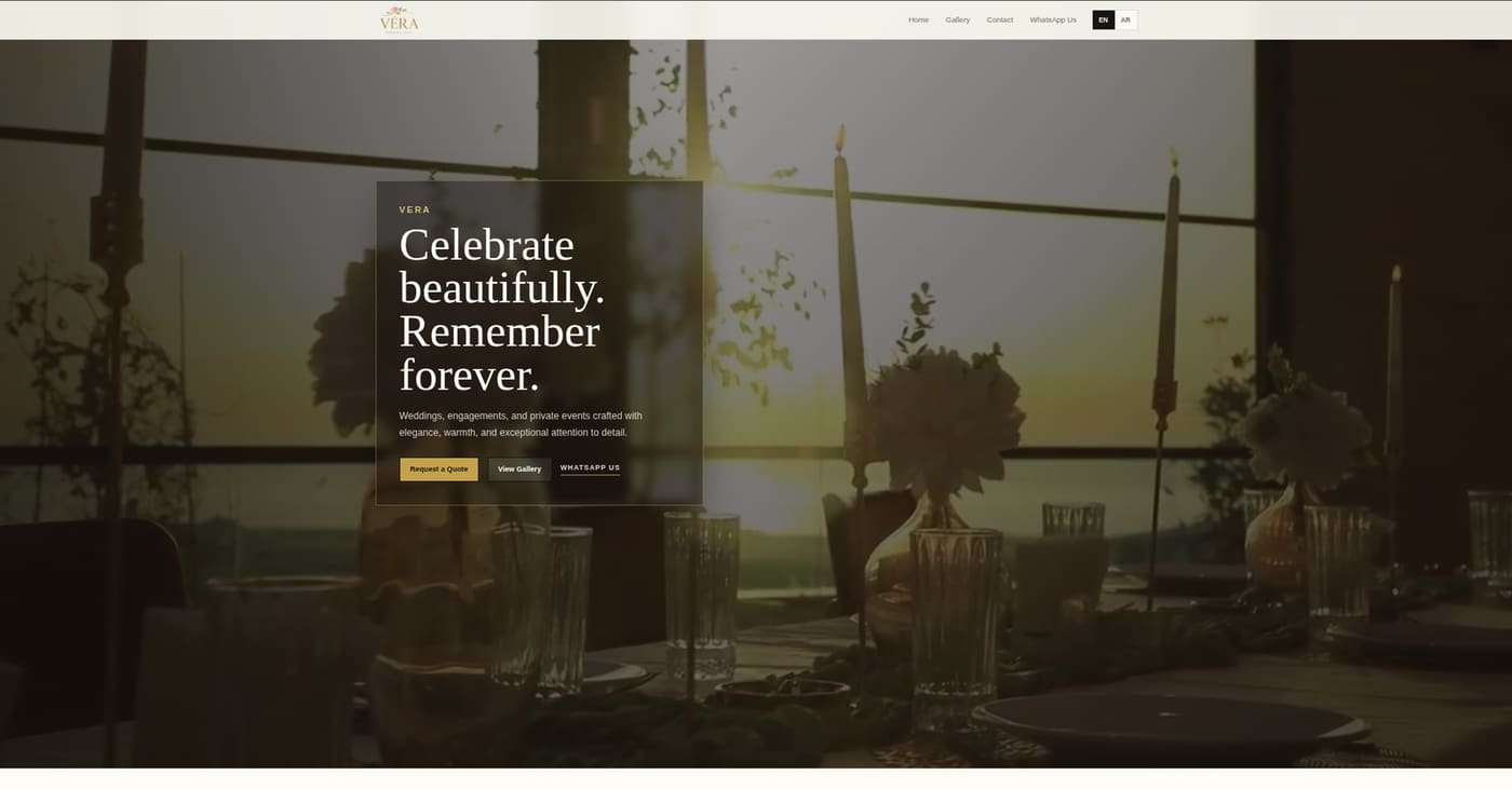
A venue website has an unusual job. It must create an emotional first impression, answer practical questions and help someone take the next step—all before a visit has happened. For Vera, that meant building around anticipation rather than simply arranging photographs on a page.
This is the story of how we approached the work. The finished project is documented in the Vera case study; here, we focus on the decisions and sequence behind it.
1. Understanding Vera's brand
We started by separating what Vera needed to communicate from what the interface needed to do. The brand language called for refinement, calm and confidence. Visitors, meanwhile, needed to understand the setting, imagine an occasion there and know how to ask for details.
That distinction became a useful filter. Every visual choice needed to support the brand, while every structural choice needed to support the visitor.
2. Translating luxury into digital design
Luxury online is often mistaken for decoration. We treated it as restraint: generous spacing, deliberate typography, strong image hierarchy and fewer competing actions. The interface leaves room for the venue to speak, then introduces information at a pace that feels considered.
Contrast and scale create drama without relying on ornamental UI. The result feels premium because it is edited, not because it is busy.
3. Designing for mobile-first discovery
Many first visits begin on a phone—through social media, search or a shared message. Mobile was therefore the primary discovery context, not a compressed desktop afterthought. We shaped image crops, reading lengths, tap targets and calls to action around one-handed browsing.
This mobile-first mindset is central to our broader web development practice: performance and usability are design decisions from the start.
4. Structuring the visitor journey
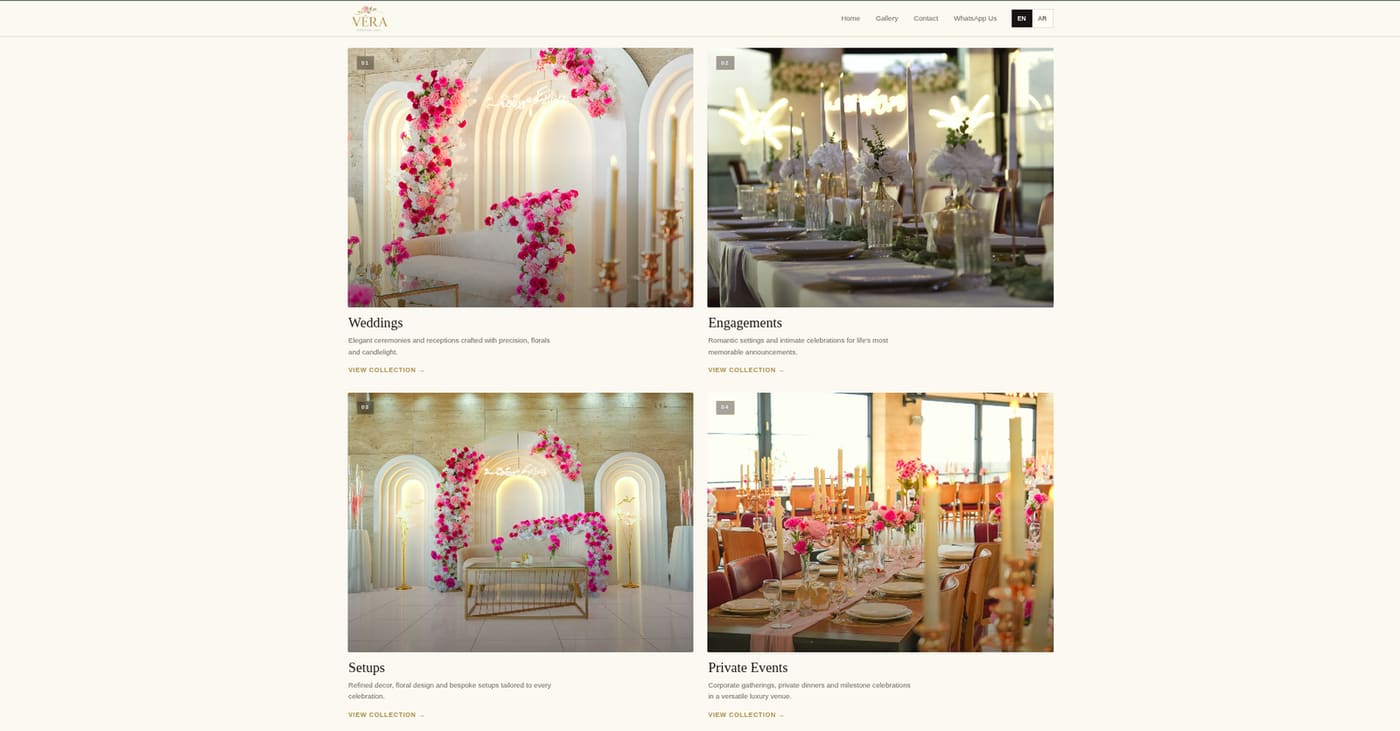
The journey moves from feeling to evidence to action. Visitors first encounter Vera's atmosphere, then explore spaces and event possibilities, then find a clear path to inquire. This sequence mirrors how people make a high-consideration hospitality decision.
We avoided presenting every detail at once. Each section has one job, giving the page a natural editorial rhythm.
5. Building the experience
Development focused on preserving the design's pacing across screens while keeping the site responsive and maintainable. Reusable layout patterns created consistency; careful image handling protected visual quality without ignoring load performance.
The work reflects the practical engineering approach we bring to projects in Lebanon software development: clear architecture, purposeful interactions and a production-ready foundation.
6. Creating an SEO foundation
A beautiful site still needs to be understood by search engines. Semantic page structure, descriptive metadata, accessible image context and crawlable content established the basics for discovery. The goal was not to force keywords into the experience, but to make the real content legible to both people and search systems.
7. Conversion through WhatsApp and inquiry flows
For a venue, conversion often starts as a conversation. WhatsApp and inquiry routes were placed where intent naturally rises, allowing visitors to move from browsing to asking without hunting through navigation or committing to a long form.
The interaction remains low-friction while preserving the premium tone: direct, visible and never aggressive.
8. What's next for Vera
The foundation can grow with Vera. New event stories, expanded venue content and richer planning resources can be introduced without changing the core journey. As real search and inquiry behavior develops, those signals can guide future editorial and product decisions.
9. Conclusion
Vera shows that a hospitality website works best when brand and utility are treated as one system. Atmosphere earns attention; structure builds understanding; a clear inquiry path turns interest into conversation.
If your brand needs the same balance of identity, engineering and practical conversion, talk to RoyTech.